While capacities are reduced at its theme parks, the Walt Disney World Resort is taking the opportunity to give one of its original hotels a fresh new look.
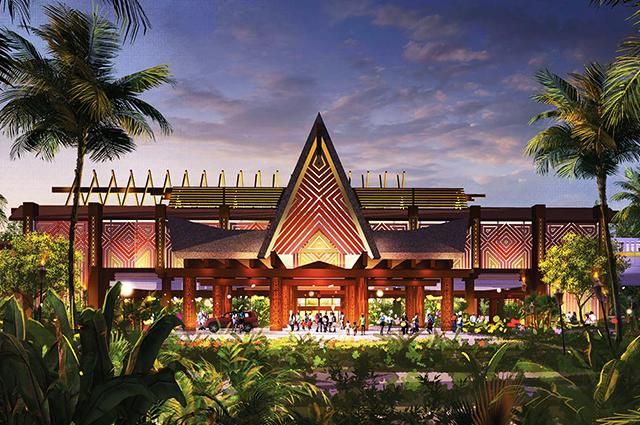
We told you earlier that Disney was postponing the reopening of Disney's Polynesian Village Resort for a substantial refurbishment. Now Disney is sharing a first look at what the entrance to the hotel will look like when the Polynesian returns next summer.

The new porte cochere will feature a "high-pitched open-truss roof covered in a thatch style," said Imagineering's Walt Disney World Site Portfolio Executive Zach Riddley, who also said that the design team was inspired by "the iconic mid-20th century architecture that the Polynesian is famous for."
"The monorail station will be transformed with bold new wooden screens covered with geometric patterns in bright, tropical colors," he added.
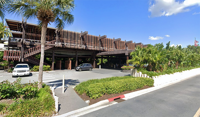
Compare the concept art with a recent view of the Polynesian's entrance from Google Street View. (I didn't have a photo because... well, this isn't exactly a view that inspires you to get out the camera, is it?)

The Polynesian's Great Ceremonial House and select dining and retail locations within it will remain open during the renovation of the resort, which is scheduled to be complete by next summer.
* * *
We wanted you to read this article before we make our newsletter pitch, unlike so many other websites. If you appreciate that — and our approach to covering theme park news — please sign up for our free, three-times-a-week email newsletter. Thank you.
I always hated taking out the lobby fountain display...but as the photo above shows, this is an improvement, makes it stand out a lot more as the entrance was one part of Polynesian that just felt so bland.
The Grand Floridian is cookie-cutter? Puh-lease.
Yeah, I would never call that place some 'cookie cutter," the one major place my family never stayed at as so swank and fancy.
The new entrance is a big improvement. Agree the fountain should have stayed, although they would have had to find some other way to add space and make it less crowded. But its still nicer than most hotel lobbies in the world. Granted my expierence is from pictures, but nothing cookie cutter in sight, except the old entrance that looks like a cheap motel that they tried to make to look unique and exotic, but failed.
That's impressive! On the downside, it will probably mean that I will have to sell an extra grandchild to afford a night there when it reopens. I haven't got enough immediate family to sell for a night in the bungalows. But, this concept drawing is impressive.
Neat. I had visited the Polynesian on a "tour the theming at the resorts" day of my vacation in March, but since I arrived via boat and left via monorail, I never actually stepped out the front door to see this underwhelming "backyard pergola covering the garage" decor -- so very inconsistent with the fancy lobby. The renovation makes the porte-cochere consistent with the facade of each longhouse. I guess the resort must've been originally designed for its "good side" to be facing the lake.
Folks do forget that in the '70s, hotel decor wasn't quite what we know today. So back then, places like Contemporary and Polynesian were very impressive and striking. Today, after so much better "theming" of spots (which Disney helped inspire), it's more obvious the place is lacking. So this is good as a WDW resort should be an impressive, striking appearance not look like some run-of-the-mill hotel in a tourist spot in a Southwestern road trip.
thecolonel jumps on a TPI thread to attack Disney ... Shocker.
The funny thing is: you don't ever see the Poly from this angle! You come in, whether from a car or a bus, from the side. The street entrance to the parking/lot or hotel is before you'd ever get this view. So this seems a bit silly. What works about the current entrance is that you're under a canopy, with thick foliage on the left, the hotel on the right, and you feel like you're stepping into somewhere lush and tropical. The low ceiling (monorail is overhead) has a similar effect to the train tunnels at MK, transporting you into the lobby. I worry here, that the new entrance will be grand, yet too open (oh joy, we can see the parking lot now!) and less transformative. Those early Imagineers knew what they were doing.
The previous atrium was just so iconic and beautiful that the current just makes it feel like a another hotel. It gave the GCH a distinct character. It felt like a living breathing thing.
This change makes me feel like it's a mea culpa and a great one at that. The rendering is so beautiful.
C'mon disney, have some fun with the lobby, stick some lava tubes in there, Tropical trees, put some pineapple groves in some of the gardens and coffee trees
This article has been archived and is no longer accepting comments.
Soon it will be just as boring and cookie-cutter as the Grand Floridian. Farewell my beloved Polynesian, I will still visit your eclectic, distinctive charms in my mind.