The Walt Disney World Resort is giving its most famous icon a new look.
The resort announced today that it will soon begin work on the Magic Kingdom's Cinderella Castle to give the park's centerpiece a royal makeover in advance of its 50th anniversary next year. This won't be the radical transformation that saw Disney change the castle into a "birthday cake" for the Magic Kingdom's 25th anniversary. Instead, it will update the castle's color palette in a style similar to that which Disney's Imagineers brought to Sleeping Beauty Castle at Disneyland last year.
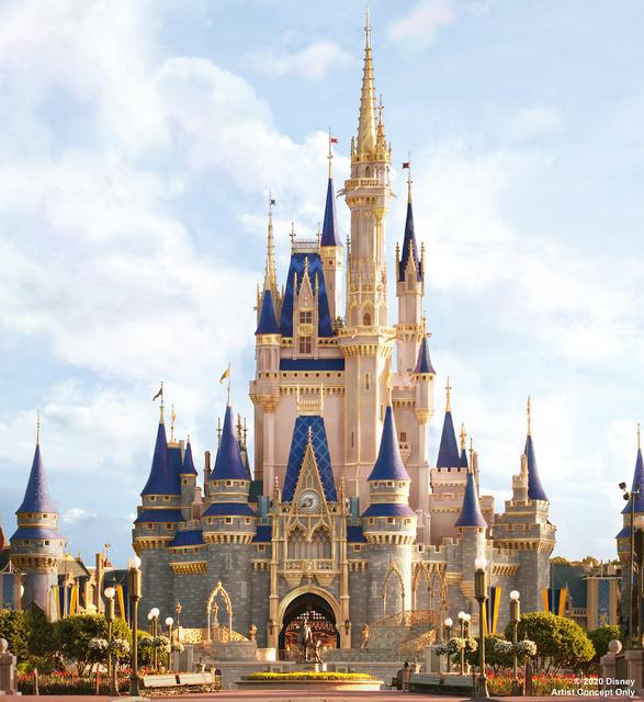
Here is Disney's concept art for the "new" Cinderella Castle:

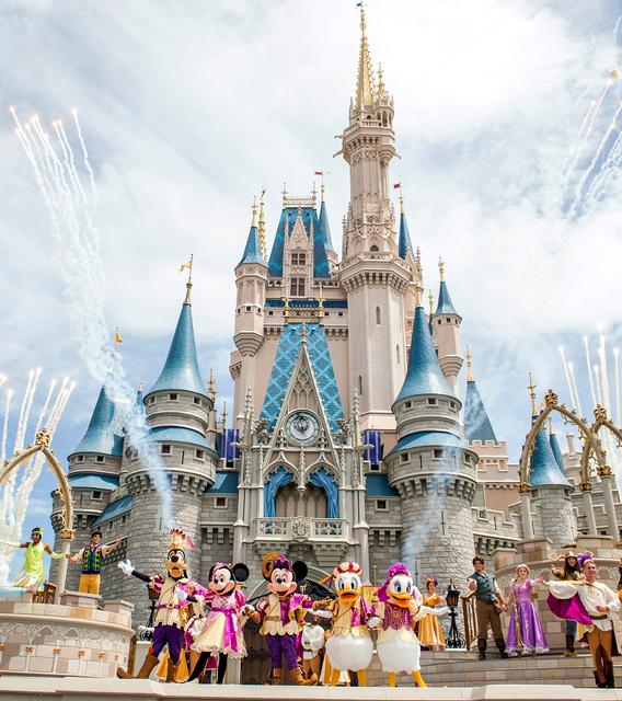
And, for reference, here is the castle's current look:

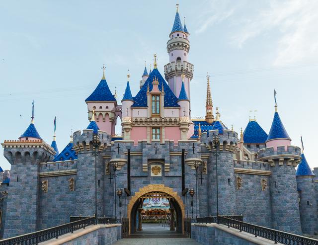
Now compare both to the recently refurbished castle at Disneyland:

The new look in Orlando leans heavily on gold trim, with the castle walls getting more of rose tint over their former gray. The shading also appears to lighten the farther up the castle it goes, reinforcing the visual illusion of great height. The rooftop blues also darken overall, creating more contrast with the golden "Notre Dame" spire at the castle's top.
Disney Imagineer Kim Irvine took me and a few other invited reporters for a tour atop Disneyland's Sleeping Beauty Castle last year as Disney was completing work on that castle, if you'd like a bit more background into the design philosophy behind Disney's castles, which I believe is reflected in today's concept image.
The Disney World castle transformation project will begin in the new few weeks and continue through the summer.
TweetVery nice! “You stay classy, Magic Kingdom!”
I think it will look really sharp. The contrasting colors will help give it a little more depth and show off the shape and details of the castle more.
And I've always appreciated that Disney's castles include machicolations and a tunnel past the gated entry into Fantasyland with (I'm assuming) murder holes to help repel advancing armies or unruly customers waiting to be called for their place at Cindarella's Royal Table.
Just looks like a touch up of faded paint to me *shrugs*
Far too much gold...
When considering old (historic) traditions in western (European) architecture, it's completely out of pace with intrinsic meaning of gold leaf application.
Gold was used to enhance toppings (coupolas, spires, skyward oriented details..) never to frame everything all around and from the bottom up or down.
Gold actually is symbolising "heaven". Using it from the bottom, making frames and pointing downwards, is trashing the cultural connotations.
I like the design. But have always loved it's current look anyway.
Does anyone know what this means for the castle in next few months? Will be there in May and one of the highlights of any WDW trip is that first view of the castle as you enter Main Street. That excitement is priceless. Will there be scaffolding or will it be completely covered - with the projections of 'Happily Ever After' on that covering?
How long was the Disney Land Castle covered for?
I don't mind the extra touches of gold. It's not nearly as gaudy as the DL50th makeover that the castle got with all of the characters plastered across the spires. The change here that I REALLY like is the darker blue used on the spires. The current light blue can often get lost in a clear sky, which looks really strange in wide angle photos. My only concern with the darker blue is how it will reflect light during projection shows. While Disney doesn't use the top of the spires that much during Happily Ever After, one of the spires is used in what I feel is the most clever visual effect of the show (Genie Rocket).
However, I'm definitely not a fan of the pink hue. Given that the renovated hub and Plaza Garden area are dominated by beige-tinted concrete and walls, turning the remaining beige areas of the castle pink creates even more disconnect between the castle and the surrounding grounds. I really like the colors of the Plaza Garden areas, but the clash with the now dark grey castle walls was already discontinuous. Now that they're removing any remaining connection between the castle and the renovated hub, it drives a wedge between these 2 areas that should architecturally be in concert. While the disconnect was initiated with the Plaza/Hub renovation, Disney is choosing to widen the architectural gap between these areas with this latest castle renovation.
I think the concept looks great. I think it keeps the fantasy element of the castle conspicuous without being too bold. It's almost as if this will add a little something special to people's photos that include the castle.
Nice work Disney.
I think it looks good, bright and clear, not too much of a change (really, the cake thing was too over the top) and works out well.
I'm a little surprised that people are not enthusiastic about this. Even more surprised that people don't think this is a rather big change and may not even be noticed by some people.
Frankly, I think it looks fantastic. I love the warmth of the rose paint, and the gold accents and the richer blue-purple.
I hope they keep this color scheme. For one, it would finally make it distinct from its twin over in Tokyo - and thus, make each park's castle unique. If not in form, than in palette.
Everyone has their own opinion, and I don't besmirch anyone for theirs, though I definitely am in love with this concept art, and am excited to see it come to life for the 50th (and beyond?)
It gets two thumbs up from the Plums!
Love the gold trim. It’s a big improvement.
@Smithjoe77, Disney Food Blog reported that all Castle shows, the ones on the stage in front and Happily Ever After will continue during the makeover.
This article has been archived and is no longer accepting comments.
It's...fine. I agree that the cake was over the top, but this is really not much of a change. I'd say it's a step down from what was done at The Magic Kingdom to celebrate Disneyland's 50th anniversary. I doubt the causal guest will really notice any difference at all. Still, it also won't piss anyone off either. Quite safe.