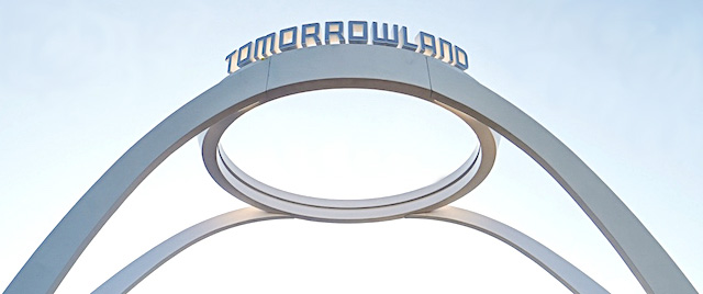
Walt Disney World today installed a new marquee for the Magic Kingdom's Tomorrowland.

With two sweeping, minimalist white arches meeting in a circle atop the entrance to the land, the new sign evokes the Googie architecture of the Pereira & Luckman/Paul Williams Theme Building at Los Angeles International Airport.
Walt Disney Imagineering designed an interior overhaul of that building in the 1990s, so WDI is well familiar with that structure. This installation in the Magic Kingdom provide the latest example of WDI installing at the Walt Disney World Resort designs inspired by famous sights in the Los Angeles area that aren't meant just to reproduce an LA-area sight, following the CA-110 tunnel entrance to Star Wars: Galaxy's Edge.
Meanwhile, back in the real Southern California, work continues on the new entrance to Disneyland's Tomorrowland, following the removal of the 1990s-era rocks as part of the Project Stardust park renovation program.
TweetHow can the world of tomorrow look so bland? This sign is straight from the XYZ Corporation Style Template. The George Clooney movie had more pizzazz and inspiration than this.
Its only fair to withhold judgement until the area behind it is done being rethemed. Yea it looks bizarre now, but when all is done and the area looks the way its intended I think it will look good.
I really hope this is precurser to what we can see Tomorrowland becoming between now and the opening of Tron. I really love the Jules Vern look that had been in Tomorrowland for several decades, but this reminds me of the somewhat stark, clean, uncluttered feel of Tomorrowland when the MK opened.
If they are going to move away from the Jules Vern look, I hope this is the new direction.
It looks like a ring setting without the stone. I liked the old better but then again, I'm not there to stare at the signs in the park.
This article has been archived and is no longer accepting comments.
... and it wasn't there on Sunday !!