Now that Hersheypark will be spending millions to build a new entrance, what other theme parks could use substantial make-overs for their front gates?
A park's entrance provides its first impression to guests. Unfortunately, some parks fail to start their guests' days off right with an entrance that provides both easy access and inspiring views. A bad front entry sets a poor tone for what ought to be an amazing day.
That's why most parks keep tweaking their entryways. Ever seen an old photo of Disneyland's entrance? Yes, the Main Street train station and Mickey floral display are there... but so is an ugly chain link fence to keep non-paying visitors out of the park.
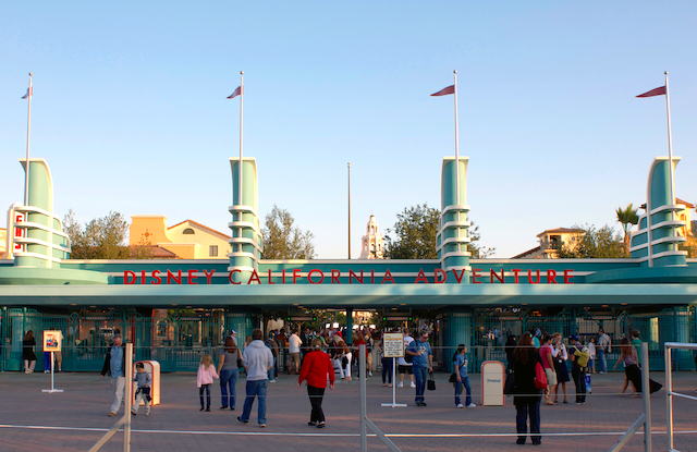
Disney spent a lot more money upgrading the entrance to Disney California Adventure in 2012. The original entryway to Disneyland's second gate was okay, from an operations perspective. It did the job, and people enjoyed taking pictures with the CALIFORNIA letters in front. But the style was all wrong for a Disney theme park. Today, with its Pan Pacific Auditorium-inspired gates (duped from Disney's Hollywood Studios in Florida) and its 1920s Los Angeles "Main Street," the DCA entrance sets a much more enticing scene for a greatly improved park.
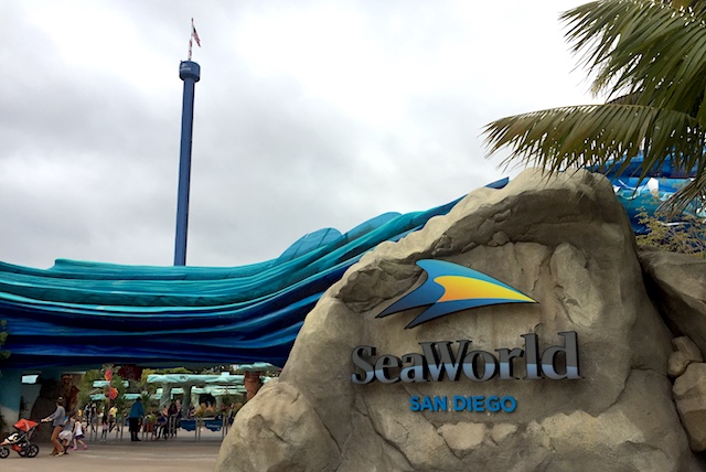
SeaWorld in San Diego changed its entry earlier this decade, too. With a wave sculpture flowing over the entryway, this plaza is unmistakably "SeaWorld." A welcoming collection of touch pools just inside the entry reinforces the theme of a ocean-focused playground where education is as much on the program as having a good time.
So what other theme parks need to upgrade their entryways? Here are three suggestions:
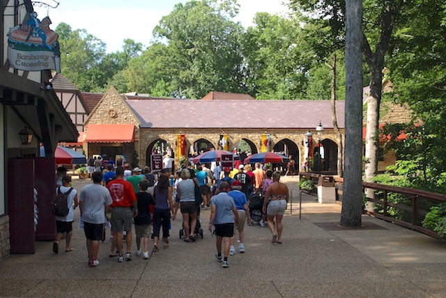
Busch Gardens suffers the same issue that Hersheypark has — its entrance lies at the end of a relatively narrow, winding path. There's no grand vista. No Instagram-worthy weenie. No sense of "place." It's just a trail to the turnstiles, with no big visual reward at the end. Busch Gardens compounds the problem with a steep elevation grade, making pushing strollers a grind. SeaWorld did a good job with tweaking its entrance in Orlando and a great job with San Diego. Now, perhaps it can turns its design attention to the Busch Gardens parks, starting with this missed potential in Virginia.
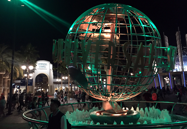
The park entrance itself is fine — amazing, really. With clean views of the globe, front gate, and even a glimpse of Hogwarts Castle behind them, Universal Studios Hollywood offers one of the most photogenic entryways in the business. So what's the problem?
Getting there. To preserve that open plaza around the globe and front gate, Universal pushed its security screening to the plaza's edge. Therefore, fans entering the park from CityWalk must hang a hard left when they reach the plaza, then walk a tight path all the way around the curving security checkpoints before doubling back into the screening area. I get why Universal did this. If it placed the checkpoint at the point where CityWalk runs into the entrance plaza, the queues for security would back into CityWalk, creating a crowd control mess. If it put the checkpoints in front of the gates, the lines of waiting guests in the morning would destroy the views around the globe. Putting the checkpoints were they did allows Universal to keep them out of photo view and to keep the waiting crowd out of CityWalk. And even the long walk helps distribute the crowd, as people who are walking in a queue are less frustrated than those standing still in one, since at least they are moving.
But that long walk just makes the whole thing feel like a poorly designed, unnecessarily inconvenient mess. At least Universal does open the plaza and move the checkpoints directly in front of the admission turnstiles later in the day, when the lines evaporate.
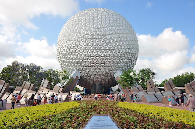
One of the greatest weenies in theme park history deserves better framing that Disney has given it. Remove the tomb-like "Leave a Legacy" slabs and restore the fountain's clear sculpture and I'd give Disney a passing grade for at least restoring the entryway view of Spaceship Earth to its original form. But Disney could do even better than that.
Build the hotel that Disney has planned for the park's entry, and hundreds of guests each night could have the most amazing view ever outside their windows. The right design could help better frame Spaceship Earth for guests approaching and just entering the park, as well. But mostly, Disney just really, really needs to tear down Leave a Legacy as soon as it can, so that people stop wondering why they are walking through a graveyard on their way into a theme park.
Which parks' entryways would you like to see get a design upgrade, and why?
TweetI’d also add Busch Gardens Tampa to that list... very tight walkways and no big reveal at the entrance. Totally unmemorable. Dollywood has a nice entrance but gets extremely backed up in the Summer, so a bigger turnstile area would be welcome.
Cedar Fair has done a good job with entrance redesigns lately, with Carowinds, WoF, and CP. King’s Island stands out as a bad one... the brown building/big banners at the front needs to go. Poor expectation for the park, and one with a nice entrance hidden behind that big, dumb building.
As far as full redesigns, WDW’s TTC and MK take the cake. The TTC is dripping with 60’s design. Not always a bad thing, but it’s got so much installed over top of it in the last 40+ years that it all clashes (especially the ticket kiosks and character silhouettes on the fences). And then, the bag line in front of the MK is a nightmare. I’d actually recommend moving the turnstiles under the train station and doing the bag checks at the current turnstiles area... and also adding an indoor “arcade” like in Paris to the Adventureland side of Main Street (should be easy, since those buildings are all connected... they can figure out another solution for stockrooms... but it would be a huge help during rain, fireworks, and parades, plus strollers and wheelchairs wouldn’t have to dodge people in the Emporium like they do now).
Not so much an entrance .... but my biggest peeve is with the Magic Kingdom. Back in the 70's and 80's when crowds were manageable, the monorail was a great and enjoyable way to get to the park. Now it's a horrible, sweat smelling, loud and obnoxious people carrying, disaster. Even the boat ride can be a trip from hell sometimes.
For a while we parked at the resort hotels, and used their monorail, but that's been taken away with all the security 'clearances' you need these days. Good for safety though, I will admit.
Here was some overlay concepts I proposed for Kings Island's (Cedar Fair) entrance:
http://matthunterross.com/kings-island/
I would say that 2 of the 3 parks on this list have entrance designs out of necessity, and would have to undertake huge projects to reconfigure how guests enter the parks.
Busch Gardens Williamsburg has 2 different parking areas (England to the west and France/tram-based lots to the east) that have converging paths at the entrance. There's not a whole lot of space where these paths come together, so the park would likely have to completely reconfigure their parking lots and paths to dramatically alter the entrance. BGW definitely doesn't have the most awe-inspiring entrance, but it's consistent with the mission and theme of the park. The entry land is a Tudor-style English village with a replica of the Globe Theater, meaning that any entrance needs to stay in scale with that opening land. A grandiose entry plaza would overpower the architecture encountered as soon as you walk through the gates.
USH's problem is CityWalk. The design is definitely more utilitarian than cosmetic, but aside from cutting the corner off where the Universal Store is, there's little that can be done without shrinking the already limited interior park space. If guests took the time to walk over to the globe (where the bus parking is), the plaza makes a lot of architectural sense (though the old 80's-style USH neon sign by the drop-off/pick-up area never made much sense off to the side). Pushing the globe into the plaza would make it far too crowded, and moving it into the park would limit space in an already space-constrained park.
EPCOT has an amazing fountain. Too bad, it's on the back side of Spaceship Earth. If they moved that fountain to the entry plaza, it would make an impressive introduction to the park, even if they kept the gravestones.
I would say DHS's entry plaza is a complete cluster. Not only do guests have to double back to reach the security area (unless they're coming from a boat or Skyliner), but the entry is far too narrow even for the limited crowds that currently show up for the half-day park - imagine what it will be like for Galaxy's Edge opening day. There's absolutely nothing grand about the DHS entry, and for a theme park that was supposedly patterned to look like a movie studio, every Hollywood studio tour I've ever taken has a far more impressive entry than DHS.
SFMM could use a new entrance too. When not a single parking space is situated within a quarter mile of the entrance to your park, you know you have a problem.
Sea World Orlando has a very problematic entrance, which they redesigned a little more than a decade ago. The entrance is a choke point that funnels guests from a wide path approaching a ocean-side lighthouse into a claustrophobic nightmare.
Knott's Berry Farm has one of the strangest entrances of any major theme park where guests walk past a strip mall before reaching the turnstiles. I know this was the predecessor to CityWalk, Downtown Disney, and other parks that have retail adjacent to their entry plazas, but the architecture just doesn't work for me in the context of a theme park.
Definitely Universal Studios Florida. Once you enter the park, there’s nothing photogenic to look at. Just a couple of minimally themed soundstages and shops.
Islands of Adventures Middle Eastern bizarre entrance never fitted. Inside is mostly modern chain restaurants and stores.
Epcot’s garden and tomb entrance is weirdly misplaced. It inhibits good photos. The very large garden beds keeps people from standing in the best spots for photos.
Universal Studios Florida is boring. You walk into mock streets that are immediately fronted by Shrek and Minions. Keep walking.
"Islands of Adventures Middle Eastern bizarre entrance never fitted. Inside is mostly modern chain restaurants and stores."
I haven't been to IOA since June, so maybe you can list the chain restaurants in the Port of Entry. The only ones I remember are Cinnabon and Starbucks. There are three (3) other non-chain dining locations in the Port of Entry that I recall (Confisco's Grill, Backwater Bar, and Croissant Moon Bakery). Again, it's been almost 4 months since my last visit, so perhaps my memory is fading, or I neglected to note the proliferation of chain restaurants with the park (don't seem to recall many anywhere else in IOA either or even USF for that matter).
USH: "Pushing the globe into the plaza would make it far too crowded, and moving it into the park would limit space in an already space-constrained park."
They already moved the globe to where it is now.
Knott's Berry Farm
Busch Gardens Tamp needs a redesign. It would be great to build a parking structure on their parking lot with walkways over the road and convert the majority of the priority and handicapped parking area into a new entrance plaza/land. The dasplaced parking spots would all be the better parking areas in the structure. And please add some EV charger spots.
"The only ones I remember are Cinnabon and Starbucks"
"(don't seem to recall many anywhere else in IOA either or even USF for that matter)."
Huh? You cited the 2 chain restaurants and then went downhill to say there isn't anywhere else. You confirmed my statement and said nothing about the Middle Eastern Port of Entry fitted at Islands of Adventure with a bizarre mix of "mostly modern" chain restaurants and stores. And what restaurants and stores at Port of Entry are not modern and chain? Not much really.
Oh, and you missed the BEN AND JERRY'S at Universal Studios Florida. Must be your faulty memory. I'm giving you a pass because what do you know about theme parks?
You also confirmed that Universal doesn't really work hard to make the stores and restaurants match their themed environments. If you can dismiss my comments that easily, you're giving a pass on Universal's weakness as a theme park.
Six Flags Great America is underrated in great entranceways. You get through the gates (which are nicely designed) and find yourself before the huge pool leading to the double-decker carousel, a sight that's basically iconic. Really sets it apart from other parks in the chain.
Likewise, King's Island you enter before its own huge pool, fountains and replica of the Eiffel Tower.
Now, Cedar Point, it's a nice sign but the entranceway right under one of the coasters and thus huge blue rails and then pretty much open skies after that. No real feeling or flow to it and could use something to spark it up more for guests.
I'm torn on the renovations the parks have been making the past decade. In one way its great to see that they are re-investing in improving the experience, in another way they look like gentrification projects that all look the same. Honestly I think CP's and Carowinds look atrocious (and yes I have been to both and seen them in person). CP's was definitely a huge improvement over the old one and I like the look with Gatekeeper and the towers, but the giant video screen and buildings surrounding it are really tacky. Carowinds they just bulldozed a really nice looking entrance and made it look like a prison...it looks horrible in person. In the back of my mind I have a fear that Hershey's re-done entrance will come across the same way.
So if there's anything I think needs to be redone I would say Carowinds. I get that the old southern plantation style entrance wouldn't mesh well with Fury but there is still opportunity to hugely improve the aesthetics. If you look at the White Sox stadium that was built with the 90s modern look and got really bad reviews, so they redid the roof to make it look older, changed the seats from blue to dark green, painted everything black, and added a lot of plants.
Carowinds could do something like that by ripping out much of the concrete and adding greenery & topiary displays, take down the whole prison entrance structure (and video screen) and make classy looking bricks with cast iron gates and fences, and take out that godawful Cedar Fair Carowinds logo and replace it with a nice understated gold one, the entrance would look sooooooooooooo much better.
Sorry for the rant but I can't stand Cedar Fair's design when it comes to things like this. I would say KI and KD's ticket areas could definitely use cosmetic improvements but i'm afraid they're going to make them like CP and Carowind's so i'd rather not have them do it.
to answer the question....
Based on his post history, I think Russell Meyer knows a lot about theme parks.
2 out of 5 (or 22 for all of IOA) = "mostly"
Got it. I will calibrate my understanding of your posts.
"...Islands of Adventure with a bizarre mix..."
I definitely agree that the Port of Entry is "Bazar".
Huge fan of USH entrance.....& agree that Citywalk's location makes things a bit awkward, but still would take that in order to keep that entrance, lol.
"Got it. I will calibrate my understanding of your posts."
Still did not get it. "Inside is mostly modern chain restaurants and stores."
You got stuck on "chain" as it means you can ignore mostly and modern. You clearly said " (don't seem to recall many anywhere else in IOA either or even USF for that matter)" MANY? How about seeing any like Ben and Jerry's at USF?
You're just a tired old man. Stop responding to me.
You ignored the chain restaurant in USF. Calibrate your posts by not posting false information.
"Based on his post history, I think Russell Meyer knows a lot about theme parks."
If you don't mind finding the glaring errors, then he's accurate.
You don't have to be perfect to know a lot about something.
I believe Anton needs to Calibrate his perception of theme parks in general. Islands of adventure has one of the most beautiful entrances of any theme park. Is has a simple and gorgeous icon that leads you to a very efficiently planned gate. Then you enter the Port of Entry, one of the most beautiful and creative entrances of any theme park I've seen. You're right! It doesn't fit with the rest of the park. It's because this land, like any port, is where your adventures begin. Stepping out of the port, you travel to the various islands around the park. The Port "doesn't fit" because it's not an island. It's a worldly Bazaar, selling goods from around the globe. Last I checked, it wasn't stuck in a specific time period, so if it happens to serve "modern" or "chain" goods, then so be it! Markets like this literally sell anything and everything. Just because the building is old doesnt mean it won't contain more modern goods inside. It actually makes more sense than finding Pandora jewelry and Starbucks in what you must consider the most appalling entrance to a theme park known as Main Street USA. Those companies are much to new for that turn of the century land that doesnt fit into the other lands of Magic Kingdom. How does an American town make sense in a park full of lands based on imaginary places? Oh, that's right. It actually does if you take a moment to calibrate yourself and remember the story that is being told.
I have only been to KI once and that was 4 years ago...my first thought in walking up to the entrance was "wow, this place needs a major re-design at the front gate...the entrance building looks like a giant version of my old neighbor's house circa 1972"
Universal Studios has the most efficient & quickest security line of most theme parks. Designed well & don’t look temporary, like at Disneyland.
I would like Hershey and BGW to move their entrance to the middle of their parks since they’ve expanded so much from when they’ve opened. It would make it easier to get around to each part of the park. I’m thinking around Pompie and Fahrenheit. Also Hersheypark proper (not Chocolate World) needs a gift shop. Finding souvenirs was a choir on my last visit.
An example of an awesome theme park entrance- Efteling. The entrance building is whimsical and sets the stage perfectly for the theme park.
Port of Entry is a port and the Starbucks company is based on sailor character from Moby Dick. It’s also not specifically Middle Eastern, they even still have a themed area at IOA that’s themed to Baghdad.
Port of Entry at IOA is great, very well themed and tons of hidden things in it if you looked. I don't see anything wrong with it. It's one of the strongest areas theme wise in the entire park (In fact sections of star wars land will seem similar to Port of Entry) It's more Mediterranean than anything, and it sets the stage for the Adventure theme quite well.
The restaurants in the parks are pretty well themed too. Mythos and Confiscos are heavily themed, Thunder Falls is well themed for the area. 3 Broomsticks, Circus McGurkis Cafe, even Blondies are all themed well. Over at studios Lombard's is spot on and Finnegans does a good job. Leaky is perfect, Moe's tavern is spot on. Louie's inst bad. Mel's diner is done well, and Monster's Cafe is dripping with theming. Even the seldom open La Bamba is well themed as is Richter's.
I don't see that at all. However the USF entrance could definitely use an overhaul, particularly where Shrek stands.
In the wise words of Peter Griffin: "Oh my god who the hell cares?"
There is Starbucks in most all theme parks and there is Ben & Jerry's in many parks as well. Nobody cares, time to move on.
Both Universal Studios Florida and Bush Gardens Tampa enter in a corner of the park and that isn't the best. In the end the most important thing is that it's comfortable to get in so every Disney park should get a redesign.
"You ignored the chain restaurant in USF. Calibrate your posts by not posting false information."
I didn't ignore it, but I didn't realize that a single location (or 3 if you also include the Starbucks and Auntie Anne's along with the Ben and Jerry's at USF) out of 22 total eateries constitutes "MANY". I had always assumed the term "many" to mean a majority, or at least a plurality of a given quantity, but I guess I stand corrected.
If "many" really means 14%, then I suppose I need to buy a new dictionary since my Webster's defines the word many as: "consisting of or amounting to a large but indefinite number". I guess I should have realized that 3 is actually a large number compared to 22. I will work harder to avoid making such blatantly inaccurate statements in the future.
"You're just a tired old man. Stop responding to me."
As a 43-old sleepy guy, I'm just trying to understand what all you young whipper snappers are trying say with your Tweeter, Bookface, Instawhatzit, and Snapghost lingo. Thanks for letting me know that "many" is really not that many at all. ROTFL
I always used the word “Mostly” and only referred to the entrance and “Modern” is another word that I used to refer to the restaurants. If you misunderstood, I should have added a comma after Modern. You changed it to Many and expanded the argument to the whole park and USF, which is a distortion. And you also claimed there were no other chain restaurants. So try again. Your whole last post is not a rebuttal. It’s a lie. (IOA has 25 eateries (excluding the 2 character breakfast and dinner), but only 5 at Port of Entry).
So here it is again with the added comma “Islands of Adventures Middle Eastern bizarre entrance never fitted. Inside is mostly modern, chain restaurants and stores.”
Is this topic about Entrances? Russell is unclear and needs help. I wonder why Russell keeps this up. He is clearly wrong and a deceptive debater.
"He is clearly wrong and a deceptive debater."
At least I've actually been to the theme parks I discuss, or clearly note when I haven't. Have you ever been to IOA, or like BGW, you're providing your evaluation of the park based on what you can glean through your computer screen?
I think the Port of Entry is one of the better theme park entrance around. There is an aspect of whimsy to the place that's refreshing, and the decor is timeless, providing flexibility if the park chooses to pivot to a more modern aesthetic. Yes, it has it's share of chain coffee and doughnut shops (on the back side mind you, facing the lagoon and not the entrance) and ubiquitous emporiums and gift shops like virtually every theme park on the planet. However, the facade is inviting, and sets the tone for the day as well as many of the top theme parks in the world.
Yes, I went to IOA THIS JUNE 2018!!! And USF too. You apparently can't be bothered to know anything including using the computer screen.
I love Diagon Alley and Hogsmead. Quite beautiful. My trip to IOA is why I brought up Port of Entry.
I will keep talking about theme parks, even some that I didn't go to yet. I will enjoy giving Russell the vapors so he can lie about his expertise.
Hey all. Anton wins the post. He gets the most internet points and is the mostest right. We have all learned something from him and can move on to other posts. Please don't question his knowledge of chain restaurants, theme parks, or attempt to use your computers better than him because you will lose.
He is the best. He will likely confirm this in a following post.
Let's continue to treat one another with respect moving forward.
Thank you.
Great to hear Anton. Glad you had a great time, and I'm sorry I lost track of your vacation itinerary. It's a shame we couldn't meet up and settle our tete-a-tete with a spin on Men in Black since we were there around the same time.
If Port of Entry doesn't do it for you, what park would you say has the best entrance, and why?
I agree Epcot neds to do something, but move, not tear down, "Leave a Legacy" Didn't people pay for those Legacys?
Doug Jenkins: I did as a matter of fact. So yes, personally wouldn't mind it just moved.
I disagree about CA Adventure’s entrance. I think it’s plain and kind of boring, although I will admit, their old one was worse. But, at least it incorporated all of California. I know the connection Burbank has to Walt Disney’s history, but I think I just dislike LA so much, I dont’t want to relive it in a theme park. I guess that’s only really a problem for locals though!
Also disagree about Cedar Point’s. Gate Keeper, although good, isn’t one of CP’s best coasters, IMO, and seeing it at the entrance doesn’t really excite me. One of the unique aspects of CP is it’s blend of old and new, and this entrance is too modern for a park with CP’s history. Maybe if they made it look more like a boardwalk pier entrance, like the area it leads into. The entrance on the hotel end however, I love. You walk under Magnum and are immediately surrounded by rides. It’s what the park is about, so instead of passing a lot of stores, you get right to the action.
Animal Kingdom has the worst entrance of any park. You drive in on a left sided looping road and see the giant warehouse for Avater with themed rocks on only one side then you see the gigantic warehouse for Everist with the same thing and maybe the pine tree cell phone tower so magical. After parking and riding a blazing hot slow tram you pass a 90s relic themed chain resturant that is not nearly as good as the national ones at IOA and are welcomed with the smell of animal poop. Good luck finding a bench, giftshop or AC if you cannot flee the area like most guests.
Epcot somehow needs to have a more transcendent entry that is not subjected to or confined by the passage of time. It has to be re-imagined in a way that when it's done, it will be the entrance that stays.
As I looked at the proposed images of a more "parklike" spine from concept renderings it made me think that more futuristic look for Ecopt is departure from a machine or futuristic industrial space age look. Its hard in any time period to project what architecture will look like in the future.
Possibly a combination of imagery, nature, and art. And as for the structures around the entrance serving not one but multiple purposes (Lush Gardens, The influence of art and culture over centuries) Possibly moving from the past to the present as you move toward the entrance.
The last thing Busch Williamsburg's entry needs is a "grand vista". What makes that park so special is its atmosphere. That should not be ruined with some inappropriate photo op. Winding down a wooded path to an old English styled entrance is a magical way to start a day in an old European themed park. Unfortunately the new company has already ruined this experience by changing the old English BGM (Background Music) to "contemporary" music. What they really need to change are the ticket booths that do not match the park entrance. They should be old castle styled instead of the generic booths they built.
A hotel at the entrance to EPCOT? Really? If you are not staying in it, it would destroy your experience.
This article has been archived and is no longer accepting comments.
Thank you for the article. I live about 15 min away from HersheyPark. I am excited about the new expansion and entrance by Chocolate World. It was always a long walk from the parking lot, and through the narrow streets of Rhinetown to the entrance.
I agree about Epcot's entrance and Busch Gardens. For such a nice landscaped park such as Busch Gardens, their entrance is very "meh"
-Steve from PA