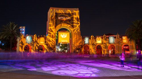
The night kicked off with a laughter filled press Q&A meeting with the HHN creatives joined by An American Werewolf in London director, John Landis, and Capcom's Resident Evil Brand Manager, John Diamonon. My favorite moment of the entire hilarity was John Landis responding to Mike Aiello talking about the detail in the houses and the little details such as the lighter and other game items from Resident Evil. John Landis responded that no one pays attention to that detail when they are busy being scared the "crap" out of. Saying, no one is going to just stop and say look at the amount of detail they put in this house....noooo they are busy screaming in fear. Of course most of the media is thinking well we are guilty of doing just that, paying attention to the detail (*facepalm*). Watch the full Q and A session below:
Before I start going house by house, let me just say this year is definitely an improvement to the slippage in quality that Halloween Horror Nights has been slacking on the last couple of years. Being a fan of the event I am happy to report that it is improved and actually worth going to see. This year is heavily populated with IP houses drawing on some of today's biggest horror franchises. Most of this years houses were good, some were amazing, while a couple of them fell a bit short.

The first of the super popular horror franchises brought to life, again, is the Walking Dead. This years house is much improved over last years version and solely focuses on season 3. The house is filled with details from the show including a full size Governors Aquarium and the complete prison block at the end if the house. There are plenty of walkers (zombies) in the house making it one of the better houses at this years event. It's a 3/5 for me on the scares and a 3.5/5 on the look, feel, and detail.
Also being brought to life is the recent remake of Evil Dead. The house follows the plot of the movie from beginning to end. As is usually always the case at HHN, the detail of the house is amazing. This house is not based on the original but last years remake and yes it does an incredible job recreating those scenes from the film, but I do have to say this one fell a bit short to me and left me a bit hanging. The scares were just not there. All the scare actors seemed to be in plain sight and to me lacked the surprise element on my walk through. It's a 2/5 for me on the scares and a 4/5 on the look, feel, and detail.
Unfortunately another dud to me was Resident Evil which focuses mainly on the 2nd and 3rd games on the franchise. When I first walked into the house my hopes and expectations from seeing the incredible entrance facade. The entrance facade was huge and almost seemed to be going from wall to wall in one of the sound stages. I do enjoy the original Resident Evil games and it was cool seeing the ionic characters and story brought to life, but everything past the facade quickly felt too spaced out. Each room was as I would describe it to wide and big to keep the element of surprise for guests. The HHN creatives even attempted to create a room where the game (or house) is in pause mode. Unfortunately it didn't work for me, and I really didn't see anything other than the sign "Game Paused" right before entering the room that would make me thing the game is actually paused. The house once again is very detailed and includes hidden items from the game that are highlighted with a light similar to in the game. It's a 2/5 for me on the scares and a 3/5 on the look, feel, and detail.
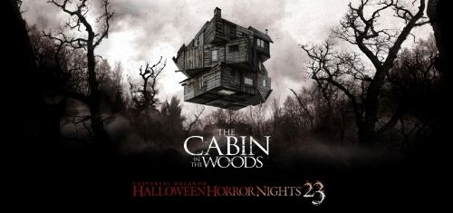
One of my favorite houses is based on last years hugely successful horror film, Cabin In The Woods. The detail of the set is amazing, and it follows the story of the film quite accurately through the house. Room for room you walk through the different iconic scenes in the movie that flipped the horror genre on its head. Everything is there, even the huge bloodied up elevator scene. This house definitely provides plenty of areas for screams from start to finish. I'd give it 4/5 for me on the scares and a 5/5 on the look, feel, and detail.
Another one of my favorites is based on the John Landis-directed 1981 classic, An American Werewolf In London. This one is just amazing for any fan of HHN and the movie. It definitely shows in this house how excited the HHN creatives were about the opportunity to bring this film to life and how incredibly close they worked with John Landis on perfecting the maze.
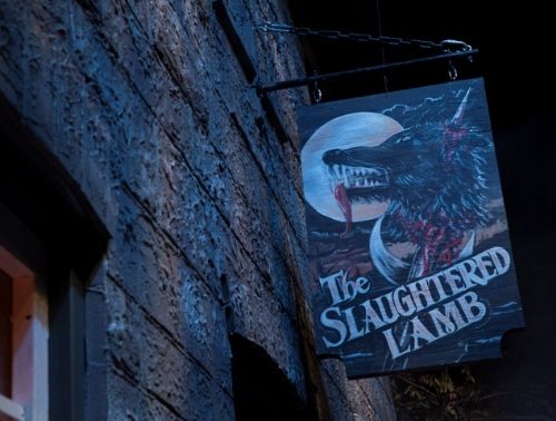
Every little detail in this house is just pure perfection. This house presents a first for HHN in that the designers recreated the wolfs with such accuracy and get this, they aren't humans inside of them! No, they aren't real wolfs either, but the designers created animatronic puppets that fluidly move and attack guests. These puppets are some of the most incredible work I have ever seen at Halloween Horror Nights and are just pure beautiful designs. Each room in this house follows the story perfectly and it just shows again the attention to detail that Universal puts into recreating the scenes from this film. There are plenty of opportunities for screams in this house and I would vouch to say this is the best house this year. It's a 4/5 for me on the scares and a 5/5 on the look, feel, and detail.

Next up is the imported house from Hollywood with an Orlando twist and touch, Urban Legends: La Llorona. This house took Hollywood by storm last year and with it's success we find it in Orlando this year. I personally never saw Hollywoods version but from what I've been told Orlando's version learned from Hollywood and took it up another notch. This house is another visually stunning masterpiece. The atmosphere inside reminded me of how spooky it would be to sit around a campfire and hear the story being told all the while hearing creepy noises coming from all around you scaring you to the core that it just might be someone coming to kill you. This house doesn't just tell the famous mexican fable, but it puts you right in the middle of it. With opportunities for screams from left to right, beginning to end, this one is a 4/5 for me on the scares and a 4.5/5 on the look, feel, and detail.

Next up we have a popular house from a few Horror Nights ago brought back in a sequel that takes place six months after the last one, it is Havoc: Derailed. The super soldiers are back and this time they are escaping from, well as the name suggest, a derailed train wreck. The train you walk through is literally turned on its head and is incredible, and the remainder of the house is a totally wrecked area. This house is just pure chaos as you would assume a train wreck would be. It is not the best house of the event, and it doesn't offer nearly the amount of scares as the other houses, and the best it has to offer is the experience of walking through a wrecked train car. It's an overall 2/5 for me on the scares and a 2/5 on the look, feel, and detail.
Last but not least it's the annual 3-D maze which of course includes the Vortex that appears every year, I'm talking about Afterlife: Death's Vengeance. Don't go to this house expecting the incredible detail that Universal is known for, but expect to be utterly disoriented in this years "fun house" maze. It's a visually disorienting house, with the flashes of backlight and ample amount of bright neon colors leaving you wondering which way to go at times. There are several rooms in this house that are especially cool with the 3d glasses you are given at the entrance of the house. This house is definitely not the scariest of this year, but it does make for quite the fun experience. It's a 2.5/5 for me on the scares and a 4.5/5 on the look, feel, and detail.
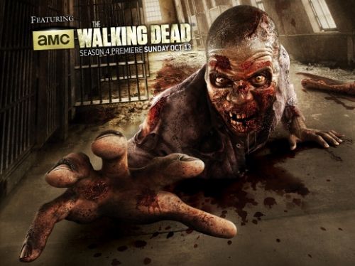
Next up we have the street experience which last year utterly failed and bombed in my opinion, this year is going back to a more rooted feel. This year Universal has taken a single theme to the streets, it's the Walking Dead. The creatives took different episodes of the wildly successful TV show and recreated them in the streets.

New York turns into Atlanta and there is even a giant tank (the creatives couldn't find anyone to let them borrow a tank, so they just went ahead and built it). Hollywood is transformed into the episode Clear with zombie traps, in the streets you will also encounter The Farm, the Woodlands, a Survivor Camp, and of course the Schoolbus is back in action. Also roaming the streets again is the Chainsaw Drill team. And for the first time I do have to admit one of them fully surprised me and got me as we were walking past the new London waterfront. One of the chainsaw drill team members was hiding behind the construction wall and to my surprise jumped out starting his chainsaw.
Also back this year are two familiar shows, The Rocky Horror Picture Show: A Tribute, and Bill and Ted's Excellent Halloween Adventure. This year I am happy to report, Bill and Ted's is once again hilarious from start to finish with solid comedy material. In past couple of years this show had declined in quality of material and laughs had been sparse, while the overall show had been lackluster at best. This year, Bill and Ted's Excellent Halloween Adventure is centered around a camp for famous Hollywood teenagers and actually has a halloween/horror theme to it fitting right in with the remainder of the parks experiences. Bill and Ted's Excellent Halloween adventure is hilariously fun, and I would go see it again and again.
This years Halloween Horror Nights 23 does not disappoint and I would definitely recommend a visit. The event runs at Universal Studios Florida on select nights through November 2, 2013. For the exact dates and tickets visit www.halloweenhorrornights.com/orlando.
Tweet
This article has been archived and is no longer accepting comments.