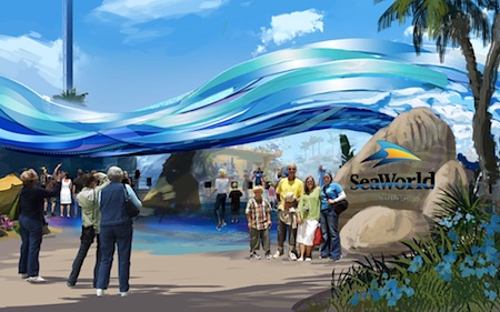
From the park's press release:
The new front gate concept will replace the existing ticket booths with a beach-themed, concierge-style ticketing area that will provide guests with a single location to purchase admission, as well as sign up for tours, animal interactions and dining experiences. Also eliminated will be the glass window between the guests and park's ticketing service representatives, creating a more open and personal experience.
Inside the park, once visitors have passed under the wave sculpture, they will enter Explorer's Reef, designed to look like they're walking on the bottom of the ocean.
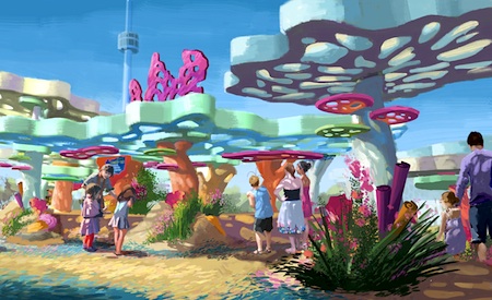
The redesigned entry plaza will feature four "touch pools," where visitors can make contact with a variety of marine creatures.
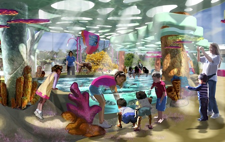
Both saltwater and freshwater, the 24,000-gallon touch pools will allow guests to connect with sea life in an intimate way. Four hundred brown-banded and white-spotted bamboo sharks, as well as more than 4,000 cleaner fish will highlight the interaction experience. The number of fish in the touch pools will total nearly 5,000.
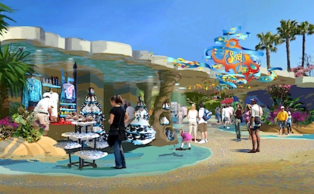
Explorer's Reef also will feature an open-air marketplace for retail and food and beverage locations.
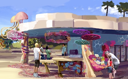
SeaWorld rebuilt the entrance of its Orlando park several years ago, to generally good reviews. And Disney just showed with its Buena Vista Street makeover of California Adventure's entrance how changing an entry plaza can improve the overall feel of a park. Ultimately, though, aesthetics are just part of the experience. I'm thinking of the touch pools as the entry plaza "meet and greet" so common in other theme parks, this time featuring the real stars of SeaWorld - the marine creatures themselves. That would give the land a solid attraction to make the park a nicer experience for visitors. And I love the idea of replacing the ticket windows with something more open and helpful. But the park also will need improved retail and especially dining to make Explorer's Reef the kind of comfortable, engaging place where you want to hang around a while. (The inclusion of vending machines on the concept art for the dining leaves me a bit skeptical on that count, I'll admit….) Long term, I'd also like to see the park do more to create a "hang around" space on the bay front at the back of the park, too.
SeaWorld will build a temporary entrance, to the right of the existing entrance, for visitors to access the park while it builds the new entryway. The new gate and entry plaza will open in March 2014.
Thoughts?
Tweet
But on paper at least... Wow.
That is something I dislike about the layout of AK. As soon as you enter park the path splits into a "Y" and there are animal exhibits. People tend to stop in their tracks with their strollers and things get blocked solid.
Granted, I have not been this year to experience Manta - so perhaps the park feels less...barren and half-dayish than it did when I was there a couple of years ago?
This article has been archived and is no longer accepting comments.
All I have to say about the open and glassless concept is the employees are going to hate that. No glass means no A/C! It looks pretty though...