But today seems to have been a more-spirited-than-usual battle among the Southern California theme park PR folks. So I turn to you, the Theme Park Insider readers, to pick a winner:
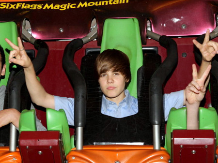
Six Flags Magic Mountain kicked it off with teen singer and perpetual Twitter trending topic Justin Bieber:

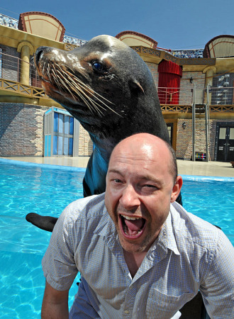
SeaWorld's usually good for some cute animals, but today the San Diego park also went with the celebrity angle, featuring former Daily Show and Hot Tub Time Machine star Rob Corddry, with Clyde of Sea Lions Live:

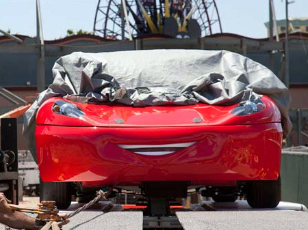
Finally, Disney unveiled the "test" vehicle for Radiator Springs Racers at Disney's California Adventure. Well, half of it, anyway:

What say you?
Tweet
And, though off-topic, I have to admit that the more I stare at that picture of Justin Bieber, the more I realize they're right when they say the guy looks like a girl in addition to sounding like one. Absolutely terrifying.
That shot of the new Car is great, especially because most fans won't have access to a shot like that. In the midst of second by second updates through so many fan sites, it is nice to see something different and actually revealing - a great way to take advantage of their own publicity machine (since not much is easy to keep secret anymore, they have to hold on to what they can and can control their own timing. Also, it looks great compared to all of the Ferrari World shots that have been coming out this week (even though most of those had come out before, they are pumping up the publicity for that park as it comes closer to being open). Great timing, being let in on a previously unrevealed secret, and the car is even smiling!
I wish Justin Bieber luck with growing up and with trying to advance himself in a few years. I hope he enjoys his fame and is getting paid, because once the little boy looks and high pitched voice goes away, so will the fame and the money. The pop star making machine will discard him like they've done to all the others, and the executives will count their money and then drop the next cash cow in the meat grinder. Here's to hoping for his sake that he comes out at least somewhat normal when it's all over. As far as his picture, I could care less. I'm not impressed by his music or the plastic fame, and I've seen a million camera phone pictures that look exactly like it
This article has been archived and is no longer accepting comments.
The one of the teen in the coaster seat simply looks like it was overexposed, and the kid himself looks like he's stoned out of his mind.
As for the one of Rob Corddry (who I'd never heard of until today), the lighting and color are pretty good but the composition is horrendous. Corddry's expression is way too contrived (it looks like he's getting ready to toss his cookies). It also looks like they used a wide-angle lens, because the sea lion's head looks distorted way out of proportion to the rest of the body. If that's the best SeaWorld's staff shutterbug can turn out, I think s/he needs a vacation.
I wonder how hard and how long they had to scrub the plexiglass barrier before they got it clear enough to be nearly invisible?
Happy travels.